**Boost Your Shopify Conversion Rate: Unlocking Success with Analytics Insights**
Strategies for Improving Your Shopify Store’s Conversion Rate Using Analytics Insights
So, you’ve set up your Shopify store, filled it with beautiful products, and even spruced it up with some eye-catching graphics. But when you look at your conversion rate, you might be feeling a little like a parent looking at their child’s report card — proud but also wondering why the math grades are so low. Fear not, fellow merchant! With the right analytics insights, you can turn those numbers around faster than you can say “I need a coffee.”
Understanding Conversion Rates
Before we dive into the juicy strategies, let’s first understand what conversion rates are. In simple terms, it’s the percentage of visitors to your site who complete a desired action — like making a purchase. Think of it as your store’s performance report card. If your conversion rate is low, it’s time to analyze what’s going wrong. Is it your product descriptions? Your checkout process? Or maybe the neon green background you thought was a “great idea”?
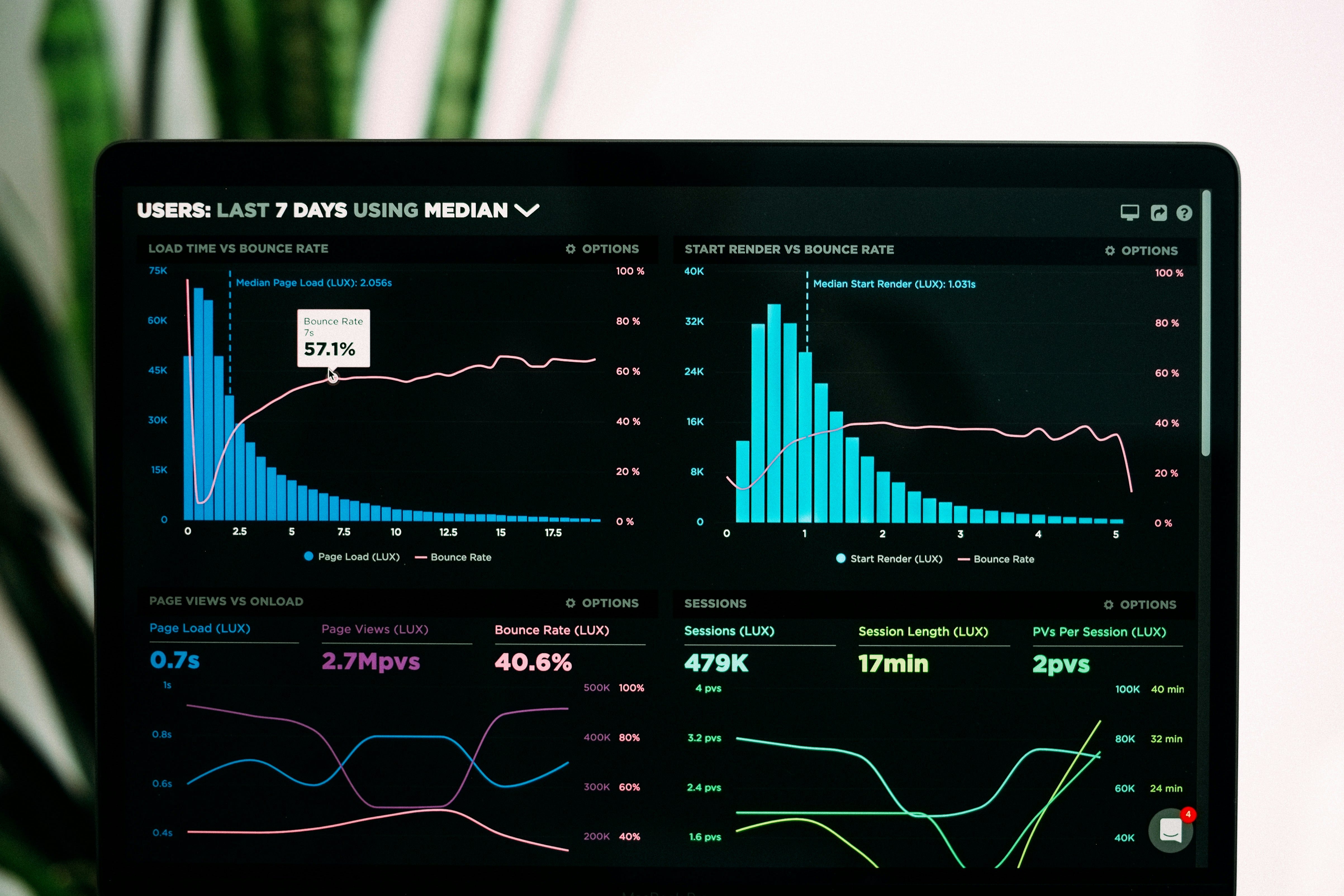
1. Leverage Google Analytics
First things first, if you haven’t connected Google Analytics to your Shopify store yet, stop reading, go do that, and then come back. I’ll be here, waiting patiently, probably eating a cookie. Once you’ve got it set up, you can start gathering valuable insights.
- Track Visitor Behavior: Use Google Analytics to see where visitors are dropping off. Are they abandoning their carts? Leaving the site on the product page? You’ll want to know so you can address these issues.
- Identify Traffic Sources: Understanding where your traffic is coming from can help you focus your marketing efforts. If social media is bringing in visitors but they’re not converting, it might be time to tweak your social strategy.
Remember, knowledge is power! Use these insights to make informed decisions. Just like knowing when to wear your lucky socks before a big meeting (trust me, it works).
2. Optimize Your Product Pages
Is your product page looking like a cluttered garage sale? Time to declutter! Your product pages should be appealing and informative, like a well-written novel that you can’t put down. Here are a few tips:
- High-Quality Images: Use high-resolution images that show your product from multiple angles. Nobody wants to buy a shirt without seeing how it fits, right?
- Compelling Descriptions: Write product descriptions that tell a story. Instead of saying “This shirt is blue,” try “This vibrant blue shirt will make you feel like you’re walking on sunshine.” See the difference?
- Customer Reviews: Displaying genuine customer reviews gives social proof. If people see others raving about your products, they’re more likely to hit that “buy” button.
Think of your product page as a first date. You want to impress, but also be authentic. No one wants to date a fake!
3. Simplify the Checkout Process
Now, let’s talk about the checkout process. If it’s longer than a Monday morning, you’re doing it wrong. Here are some tips to streamline that process:
- Reduce Steps: Aim for a one-page checkout if possible. The fewer the steps, the less likely customers will abandon their carts. It’s like a buffet — keep it simple so people can load up their plates and move on.
- Guest Checkout: Allow customers to checkout as guests. Not everyone wants to create an account — some just want to get in and out like a ninja.
- Clear Calls to Action: Use clear and enticing call-to-action buttons. Instead of “Submit,” try “Complete My Order.” It sounds much friendlier, doesn’t it?
Remember, your checkout process should be as smooth as butter on warm toast. Nobody likes a sticky situation!
4. A/B Testing
Ah, A/B testing, the science experiment every marketer loves! This is where you can really dig into what works and what doesn’t. Here’s how to get started:
- Test One Element at a Time: Whether it’s changing the color of your buttons, the text on your call-to-action, or even the placement of your images, make sure to test one thing at a time. Otherwise, you’ll be like a mad scientist throwing everything into a pot and hoping for the best.
- Analyze Results: After running your tests for a reasonable period, analyze the results. Did the blue button perform better than the green? Was the longer description more effective? Use the data to make informed decisions.
Remember, A/B testing is not a one-off thing; it’s an ongoing process. Keep experimenting until you find that perfect blend of elements that makes your customers sing with joy!
5. Use Heatmaps and Session Recordings
Ever wondered where your visitors click the most? Enter heatmaps and session recordings! These tools give you visual insights into visitor behavior on your site. Here’s how to utilize them:
- Heatmaps: These colorful maps highlight where users are clicking, scrolling, and spending the most time. If you see a lot of action on a product image but no one is clicking “add to cart,” it might be time to rethink your button placement.
- Session Recordings: Watching recordings of user sessions can be enlightening. You might discover that users are struggling to navigate your site or that they keep getting distracted by your neon green background. (Seriously, what were you thinking?)
These insights are like having a behind-the-scenes pass to your store’s performance. Use them wisely to make adjustments that will keep customers engaged and buying.
6. Implement Exit-Intent Popups
Exit-intent popups can be a game changer. They’re like the friendly salesperson who catches you just before you leave the store and says, “Wait! How about 10% off if you buy now?” Here’s how to use them effectively:
- Offer Discounts: If a visitor is about to leave your site, entice them with a discount. Just make sure it doesn’t eat into your profits too much or you’ll start feeling like a bakery giving away free cupcakes.
- Collect Email Addresses: If they’re not ready to buy, offer to collect their email for a future discount. This way, you can nurture leads and convert them down the line.
Done right, exit-intent popups can be the nudge your visitors need to complete their purchase. Just don’t overdo it; no one wants to feel like they’re being chased out of a store!
7. Analyze Customer Feedback
Listen closely to what your customers are saying. They are the true experts when it comes to your store. Use surveys, feedback forms, or even social media to gather insights on their experience. Here’s how:
- Ask the Right Questions: Questions like “What did you think of our checkout process?” or “How easy was it to find what you were looking for?” can provide invaluable insights.
- Implement Changes: If you notice a recurring theme in the feedback, take action! Show your customers that you value their opinions. It’s like getting a gold star for being a good listener.
Customer feedback is like gold; use it to refine and improve your store experience continually. It’s an investment that will pay off in dividends!
Conclusion
Improving your Shopify store’s conversion rate doesn’t have to feel like rocket science. By leveraging analytics insights and implementing these strategies, you can create a shopping experience that not only attracts visitors but also converts them into loyal customers. Just remember to keep testing, iterating, and listening to your customers. It’s a journey, not a sprint!
If you’re looking for an easy way to keep your store’s content fresh and engaging, check out the autoBlogger app. It’s like having a personal assistant who writes amazing blog posts for you while you sit back and enjoy your coffee. Now, go forth and conquer that conversion rate!
Note, this article was written with AI assistance to improve readability and give you, the reader, a better experience! :)
Labels: ohermans1
posted by Jao @ September 09, 2025
0 Comments
![]()

0 Comments:
Post a Comment
Subscribe to Post Comments [Atom]
<< Home